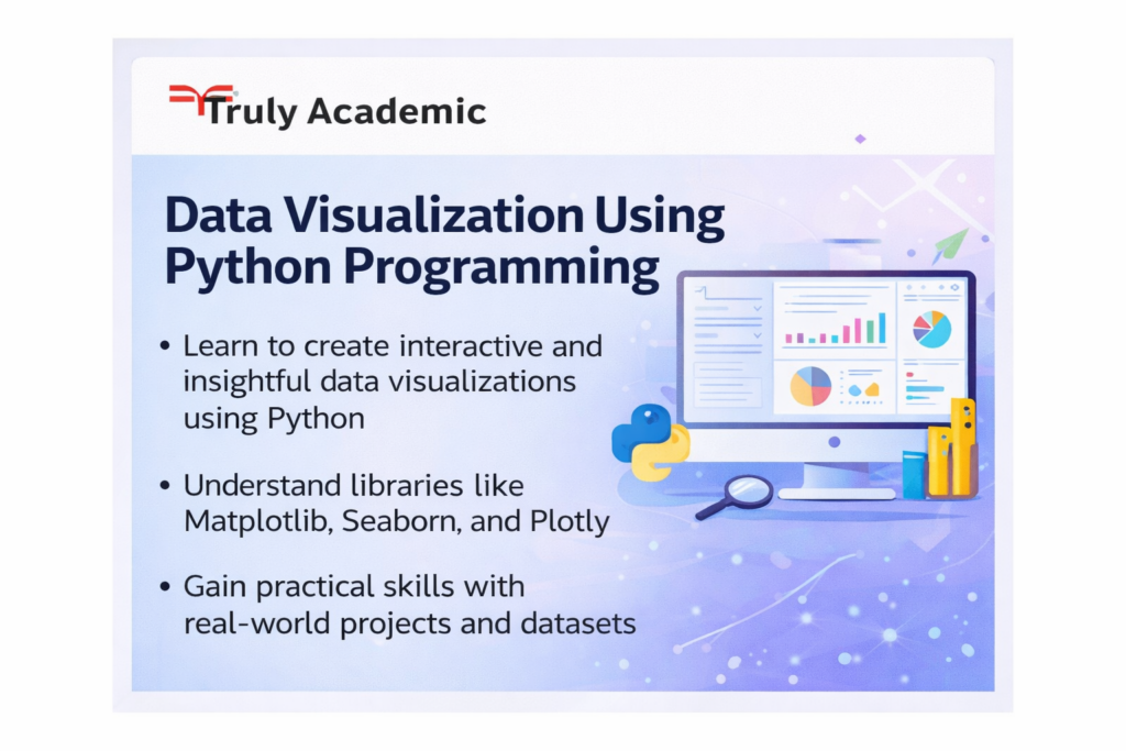
Data Visualization using Python Programming
Transform Raw Data into compelling Stories: Master Visualization with Matplotlib, Seaborn & Plotly.
Go beyond basic charts and become a storytelling expert with data. This hands-on course dives deep into the powerful Python visualization ecosystem, teaching you to create static, interactive, and publication-quality visuals. You’ll learn to translate complex datasets into clear, impactful, and beautiful narratives that drive decision-making.
Key Highlights:
Master Core Libraries: Gain proficiency in Matplotlib for foundational plotting, Seaborn for statistical elegance, and Plotly for interactive, web-based visualizations.
From Data to Narrative: Learn the principles of visual perception and storytelling to choose the right chart for your data and message, moving beyond default plots.
Build Interactive Dashboards: Use Plotly Dash to create and deploy simple, functional web dashboards that allow users to explore data dynamically.
Customization & Aesthetics: Learn to control every element of your plots—from colors and fonts to layouts and annotations—to produce professional, on-brand visuals.
Real-World Projects: Visualize diverse datasets (financial, social, scientific) to build a portfolio showcasing line charts, scatter plots, histograms, heatmaps, and geospatial maps.